BNHP 2017
Bank of New Hampshire Pavilion 2017 Series Elements
Art Direction/Design
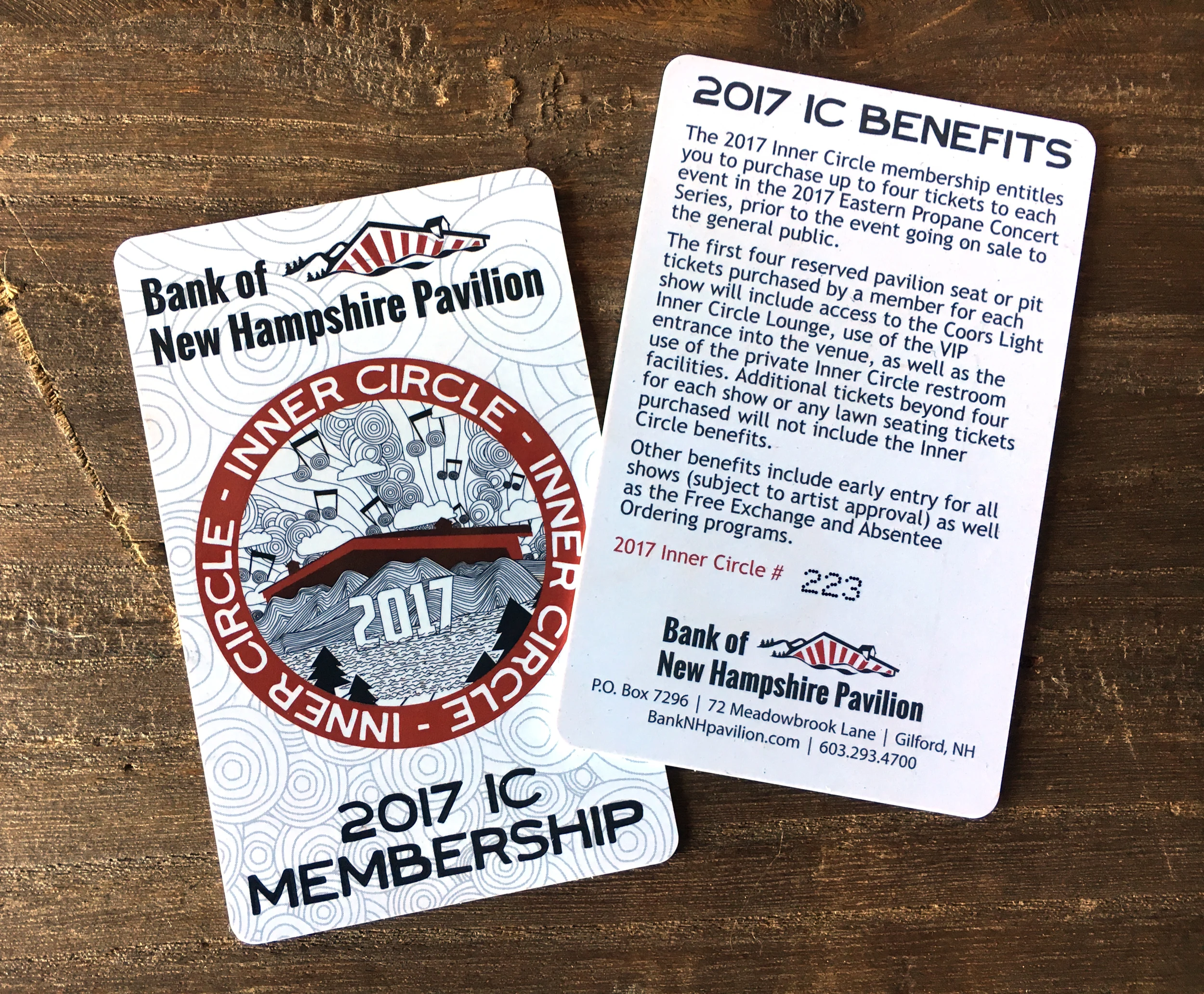
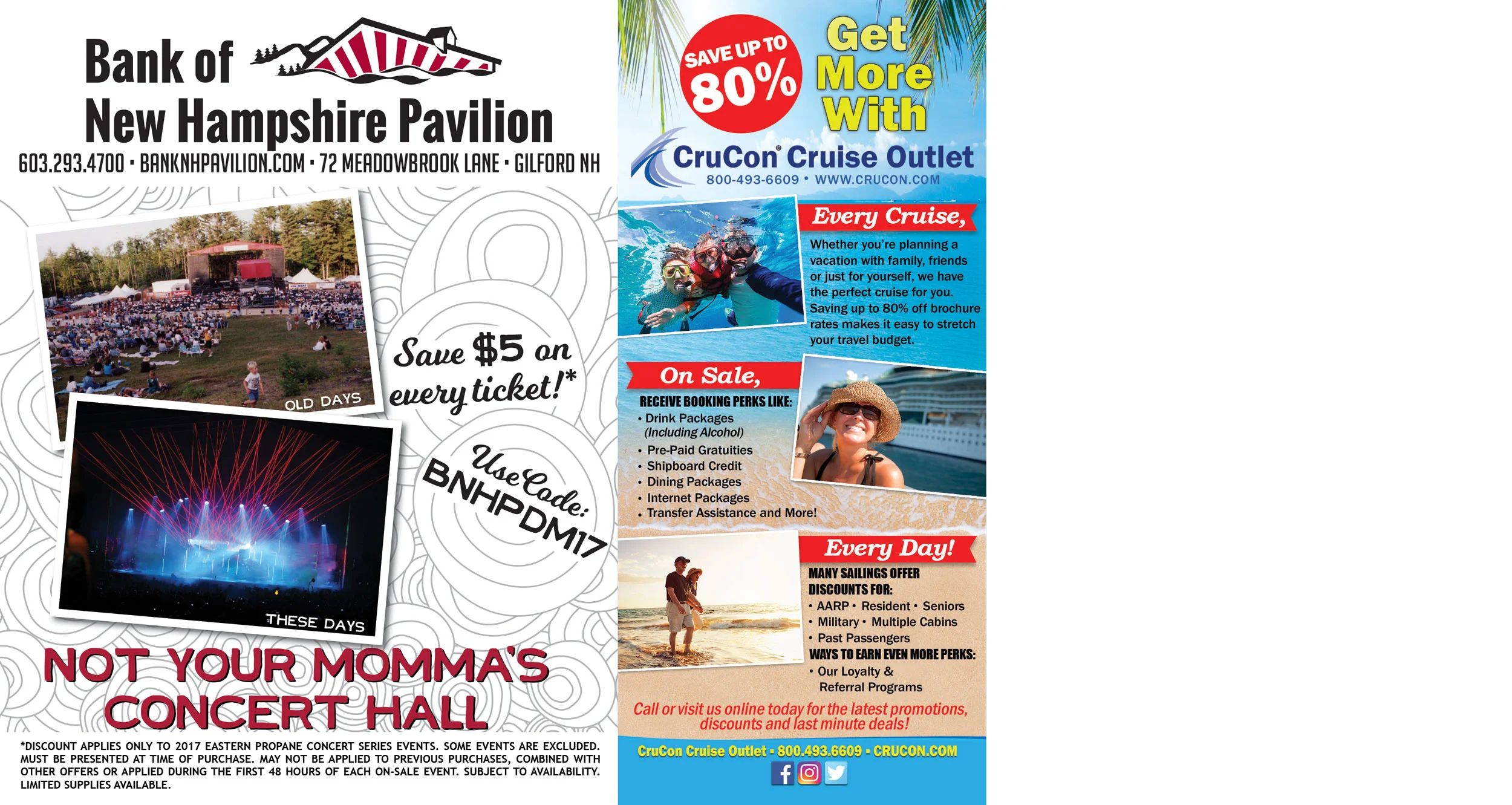
Each year Bank of New Hampshire Pavilion uses a new motif to keep a fresh look for the new concert season. The motif is used for all seasonal branding, from website graphics and series posters to direct mailers and program books. As the venue's marketing assistant and graphic designer, it is my job to create and implement the motif.
For 2017 I focused on the venue's location - just off the shores of Lake Winnipesaukee in Gilford, NH - and played off the popularity of adult coloring books. The result was this whimsical illustration of the pavilion rooflines (something we are known for in the industry) nestled in the mountains with the lake nearby. I then pulled elements from the motif, such as the circles, to continue the theme without having to re-use the entire graphic for every element as had been done in previous years.
To further play on the coloring-book concept, we turned our 2017 program book into an activity book with a puzzle on every show page. I used fun facts about the bands playing at each concert to create word searches, crosswords and matching puzzles and chose to use a matte finish paper to encourage our customers to complete the puzzles.


